
Cryptocurrency
UX Design for Crypto Payments: How to Make the Payment Process Intuitive
#crypto-acquiring
Many users abandon cryptocurrency payment halfway through due to a confusing interface. A person doesn't understand what to do next, fears making a mistake, closes the page and pays with a card.
Main problems in crypto payment UI:
- Too many incomprehensible terms—gas fee, network, confirmation
- Lack of visual hints at each stage
- Fear of losing money due to technical error
- Unclear how long the process takes
- No feedback—sent payment, but nothing happens
The UX designer's task is to turn a technically complex process into a simple sequence of actions. Users shouldn't need to understand blockchain to pay. The system guides them through steps, explains each action, confirms success.
Good UX for crypto payment works like this: A person sees familiar elements, understands what to do, receives instant feedback, completes payment in 2-3 minutes. No stress, no questions.
Basic Principles of Intuitive Interface
Simplicity above all. Every extra element on screen is additional cognitive load. Users should understand what to do within 3 seconds of looking at the interface.
Three rules for simple UI:
- One screen—one task. Don't try to fit everything: product selection, address input, confirmation—in one window
- Active element stands out. The button that needs to be clicked now is the brightest on the page

- Hints in the interface. Help users figure things out.
Visual hierarchy guides the eye: Header—key information (amount, QR code)—action button—additional details at bottom. A person scans the page top to bottom and immediately understands the sequence.
White space improves perception. Don't fill the screen with text and elements. Let eyes rest—large margins between blocks, air around important elements.
Consistency creates predictability: If the "Next" button is blue and on the right on the first step, it should be blue and on the right on all steps. Users don't think where to look—they know.
Feedback instantly confirms actions: Clicked button—loading animation appeared. Copied address—notification popped up "Copied". Sent payment—message "Received".
We followed all the rules at Heleket and created a payment interface that attracts rather than repels customers.
How to Present Crypto Payments
The optimal crypto payment presentation consists of 4 steps. Fewer—not enough information, more—user gets tired.
Step 1: Choose Cryptocurrency
Screen shows 3-5 main options: Bitcoin, Ethereum, USDT. Each has—logo, name, brief description ("Most popular", "Low fees", "Stable price").
Visually: Large cards with logos. Active card is highlighted, inactive ones are dimmed. Below—"Continue" button.
Step 2: Verify Amount
Show final amount in selected cryptocurrency and its dollar equivalent. Add network fee calculation and confirmation time.
Important: Amount should be large, noticeable. Users verify everything is correct before sending money.
Visually: Center of screen—amount in large font. Below it—"$245.80" in small text. Lower—"Network fee: $1.50" and "Time: ~15 minutes". "Pay" button.
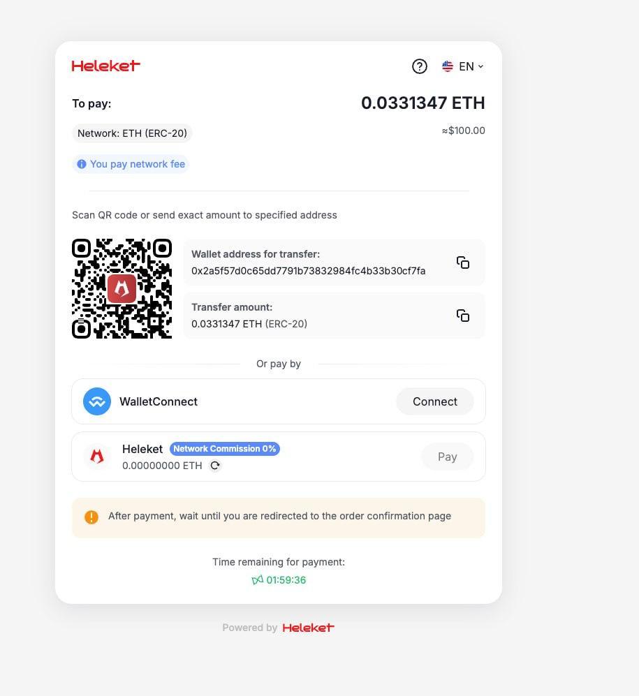
Step 3: Payment
Generate unique wallet address and QR code. Users scan code with mobile wallet or copy address manually.
Critical: QR code must be large (minimum 200x200px) and contrasting. Nearby—"Copy address" button for those paying from computer.
Visually: QR code in center of screen. Below it—wallet address with copy icon. Lower—timer "Address valid 14:52" (15 minutes for payment). At bottom—FAQ "How to pay?".
Step 4: Confirmation
After sending payment, users see waiting screen. Show status: "Waiting for network confirmation", then "Payment confirmed!".
Visually: Animated icon (loading → checkmark). Large status text. Progress bar or confirmation counter "2 of 3". "Return to order" button appears after success.
Visual Hints and Onboarding
First time users see crypto payment—they're scared. Hints relieve tension and guide through the process.
Hints near unfamiliar elements:
Mouse hover (or tap on mobile) on "?" icon next to "Gas fee" shows: "Fee for processing payment by blockchain. Goes not to us, but to network miners".
Short tutorial on first payment:
Pop-up window: "Paying with cryptocurrency for the first time? We'll show how quick it is! [Start] [Skip]". Three screens with pictures: choose currency—scan QR—done.
Progress indicator:
Top of screen: "Step 2 of 4" or visual dots. Person understands how much is left, doesn't abandon halfway.
Examples of successful payments:
Bottom of payment page: "1,247 people paid successfully today". Social proof removes doubts.
Visual feedback on errors:
If user entered wrong address, not just red text "Error", but specific explanation: "Address must start with '0x' for Ethereum. Check copying accuracy".
FAQ directly in interface:
FAQ block on payment page: "How long to wait for confirmation?", "What to do if sent wrong amount?", "How to get refund?". Answers in one click, no need to search help.
Mobile Device Adaptation
Over 65% of crypto payments happen from smartphones. Interface that's good on desktop can be terrible on phone.
Basic mobile UI requirements:
- Large buttons—minimum 44x44px for comfortable finger press
- Readable fonts—minimum 16px for main text, 24px for headers
- QR code occupies 60-70% of screen width—should scan easily with camera
- Minimal text input—copy address with one tap, QR scanning instead of manual entry
Vertical scrolling better than horizontal. People are used to scrolling down, not sideways. All elements—one below another in logical sequence.
Bottom navigation for main actions:
Pin main button ("Pay", "Continue") at bottom of screen—thumb zone, where thumb easily reaches. Don't make them stretch to top.
Test on real devices:
iOS Safari and Android Chrome render interface differently. QR code clearly visible in design, but blurry on old phone? Problem. Button covered by keyboard? Problem.
Fast loading is critical: On mobile internet, each second of waiting reduces conversion by 7%. Optimize images, minimize JavaScript, use lazy loading.
Mobile wallet integration:
"Open in Trust Wallet" button directly launches app with pre-filled transaction. User just confirms—done. This is 3 times faster than manual address copying.
Trust and Security in Design
Cryptocurrencies are associated with risk for inexperienced users. Design should inspire confidence and security at every stage.
Security indicators:
- Lock icon next to address: "Protected address"
- Payment provider certificates: regulator logos, licenses
- "Verified" badge or checkmark next to company name
Process transparency: Don't hide technical details, but present them understandably. "How it works?" block: 1) You send cryptocurrency. 2) Blockchain confirms transaction. 3) We receive payment and process order.
Show cryptocurrencies are normal: "Accepting cryptocurrencies since 2019. Over 50,000 successful transactions". Numbers and operating time strengthen trust.
Contact information visible: Support email, chat link—right on payment page. Person knows they won't be left alone in case of problem.
Real customer reviews: "Paid with Bitcoin—everything went through in 10 minutes, no problems. — Andrey, Moscow". Short quotes under payment form reduce anxiety.
Interface Speed and Performance
Every second of delay kills conversion. User clicked button, interface froze for 5 seconds—they think something broke and leave.
Loading time optimization:
- Address generation: Should happen instantly. Use pre-generated addresses in pool
- QR code: Generate on server, not client—faster on weak devices
- Transaction status check: Polling every 10 seconds, WebSocket for real-time updates
Animation instead of silence: if processing takes time, show animation: "Generating secure address...", "Checking blockchain...". Person sees system is working, doesn't panic.
Skeleton screens for loading content: instead of empty white screen—gray placeholders in shape of future elements. Creates feeling that interface is almost ready.
Caching for repeat users: if person already paid with cryptocurrency on your site, save their preferences (chosen cryptocurrency, network). On next payment—one step instead of three.
Progressive enhancement: basic functionality (address input, copying) works even if JavaScript is disabled. Additional features (QR scanner, status auto-update)—for modern browsers.